

Piranha Supplies: wholesale Shopify Plus integrated with Sage X3
A wholesale store built for professionals and made to sell
- Client
- Piranha Supplies
- Technology
- Shopify Plus
- Services
- Migration
- UX/UI
- Custom development
- Integrations
We migrated Piranha Supplies to Shopify Plus with an experience designed for tattoo artists, piercers and PMU professionals, and a deep integration with Sage X3.
Piranha is an art brand and, like any brand that takes itself seriously, it doesn't live on a name alone. It lives on an ecosystem. Behind the "Piranha" name sits a group of sub‑brands and businesses orbiting the same vision: art, tattoo and culture. Among them are Studio, Meta, Revolution Needles and the star of this project, Supplies.
Supplies is the heart of the wholesale business. It's where everything comes together: all the Piranha brands are sold here, alongside partner brands, in a model built for professionals. It's where studios, tattoo artists, piercers and PMU professionals get what they need to work. And that changes everything about how you think about an online store.
The challenge
Piranha came to Skrey with a very clear goal: take its online store to the next level by migrating to Shopify Plus. But more than changing platform, it wanted to solve a series of pain points built up over the years.
The user experience. Supplies doesn't speak to just any user; it speaks to professionals. Early on we identified the three groups that shaped the whole project: tattoo artists, piercers and PMU professionals. Everything, from product categorisation to navigation, had to be built around these personas. Integration with the real business. Piranha already had a link between the online store and its ERP (Sage X3), but it was limited and couldn't keep up with the complexity of the business. X3 held the entire product structure, logistics, OMS, pick & pack, all working. But the old integration wasn't enough: it lacked depth, reliability and scalability.
The mission was set: build a store that wasn't just good‑looking, but truly worked.
Analysis: the foundation of everything. We started at the beginning: we sat down with Piranha to gather requirements and quickly realised we weren't dealing with amateurs. This was a mature team that knew exactly what it needed, with clarity on its pain points and goals. With tight timings and well‑defined priorities, we organised everything into three levels: critical, important and nice to have.
At Skrey, analysis isn't a formality; it's the foundation. Designers don't design in the dark: everything starts on solid technical ground. We gathered requirements across the board: UX, finance, logistics, shipping and legislation, including VAT exemption for intra‑EU countries.
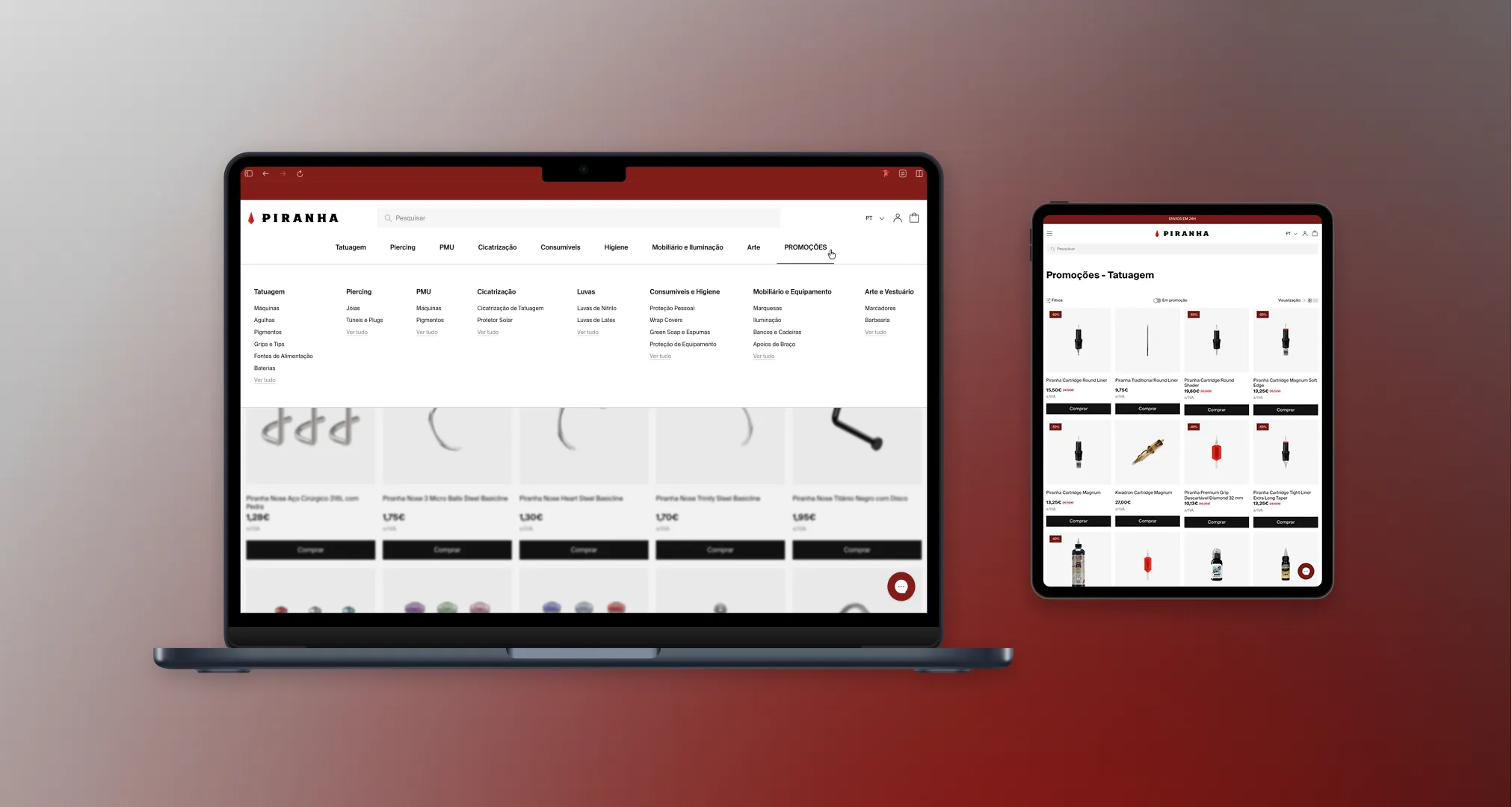
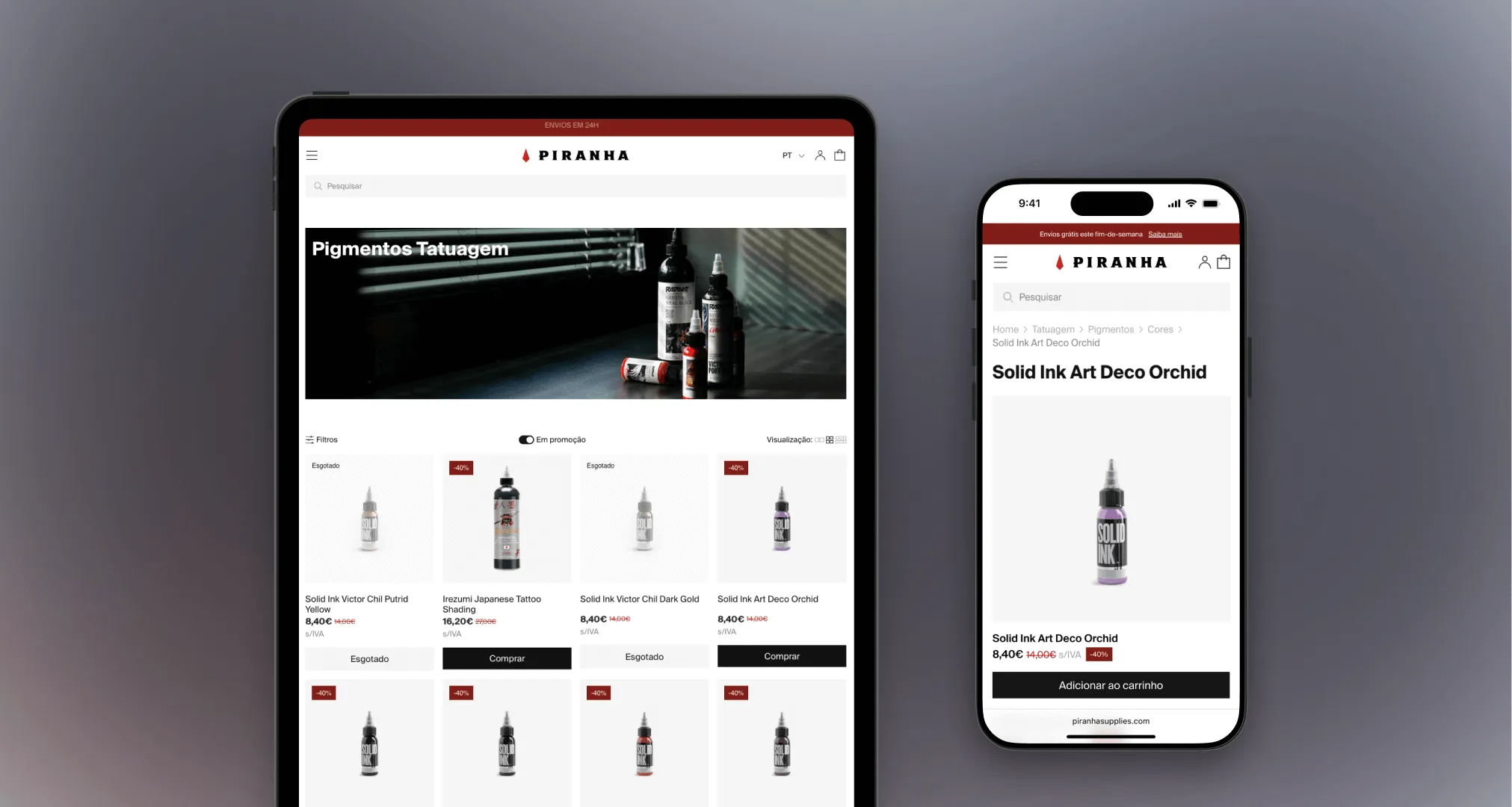
UI/UX: starting with the tablet
Piranha is a demanding brand, visually and strategically. But Pedro Dias, CEO of Piranha Global, made the number one priority clear from the start: UX. "I'll have the chance to sell the brand on the sub‑brands' other websites," he said. And then, with a confident smile: "Supplies is for selling."
We knew tattoo artists use an iPad every day at work, so we did something that isn't our standard: we started the design with the tablet. We usually follow a mobile‑first approach, but here it made more sense to start with the device users rely on every day.
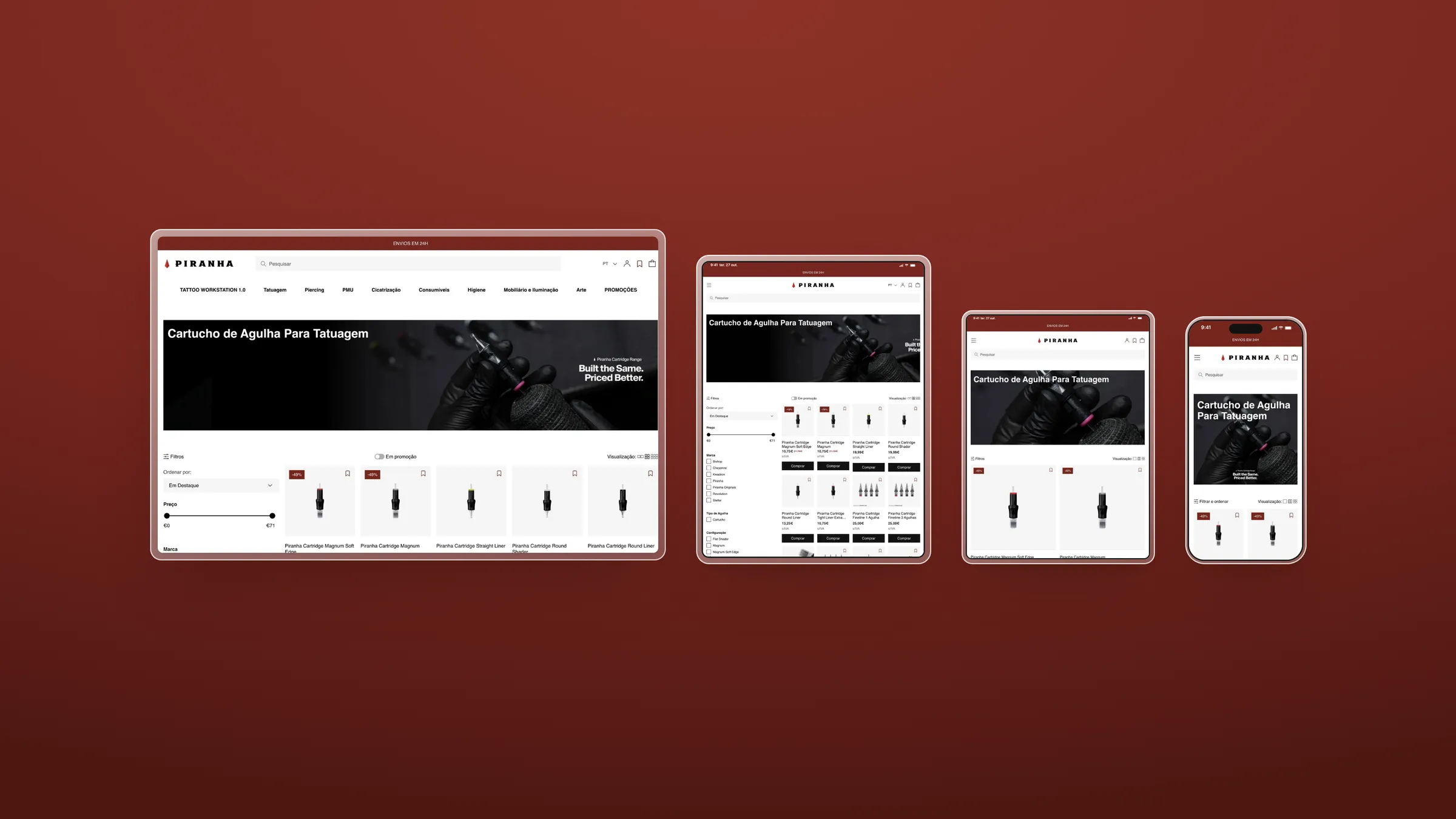
In total, we designed four distinct experiences: two for tablet (at different resolutions), one for mobile and one for desktop. Each was thought through in detail, not as a simple adaptation but as a real experience optimised for conversion.
Components designed to sell
The "Add to cart" CTA appears on every product card, from the homepage to the cart with cross‑sell, to cut clicks and speed up buying; When a product has variants and can't be added directly, the Quick Buy component steps in: not a mini PDP, but a fast experience with all the information users need to decide on the spot; Promotions aren't hidden away in a section: a toggle on the catalogue shows only discounted products, so users can spot the best deals quickly.
Catalogue and shopping experience
Piranha's catalogue is large and detailed, and how we present it makes all the difference. Our approach was simple: catalogue diversity is a competitive advantage, not a problem. Using Shopify's template system, we designed specific pages for each product type, with different experiences for each category.
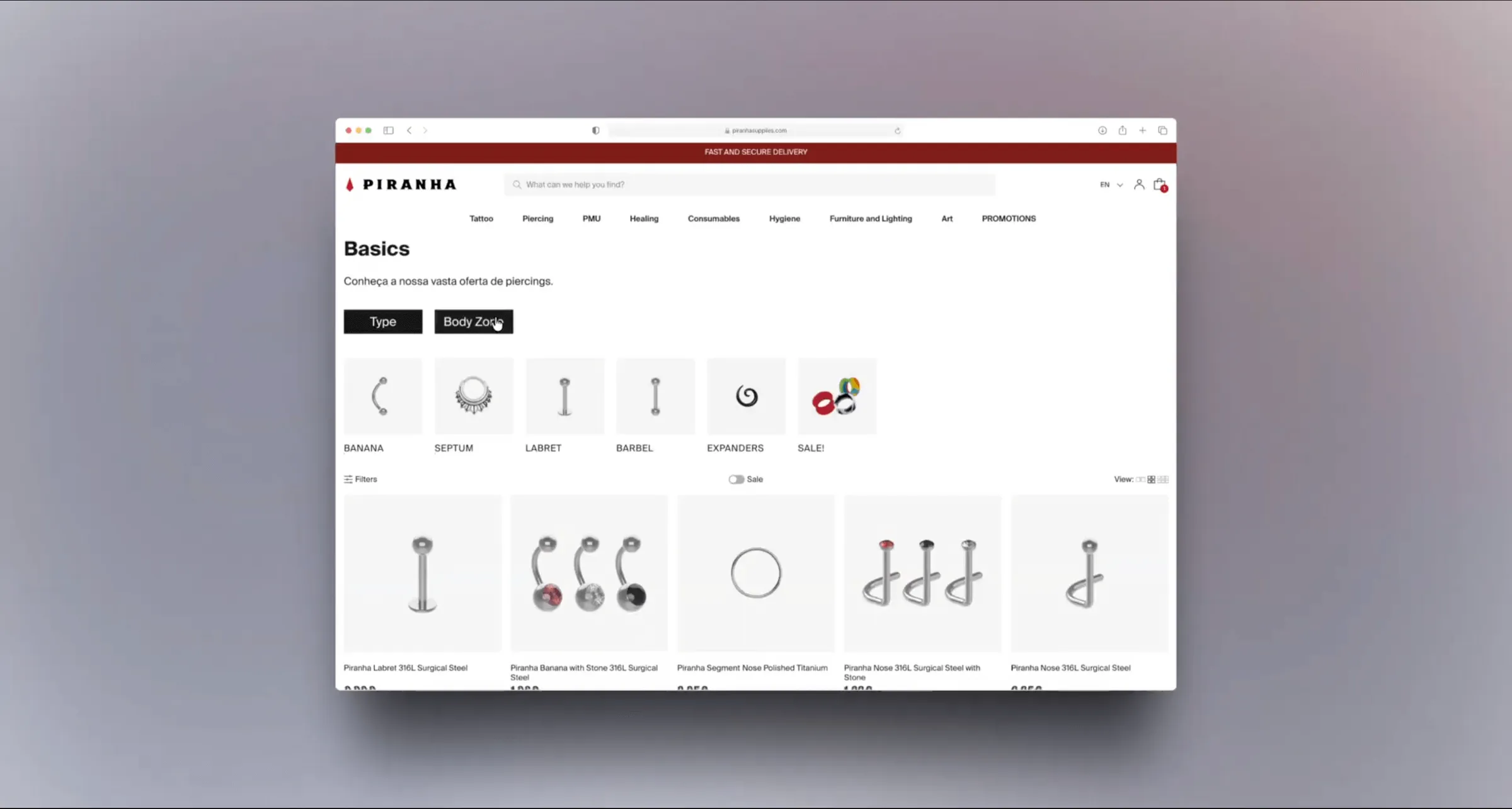
At the kickoff meeting, Pedro told us about a long‑standing pain point: "The piercing catalogue is chaos. The products are almost identical, the experience is bad and people can't choose what they want." He was right. The old filters didn't help, the images were very similar and people searched in very different ways: some by technical name (ring, barbell), others by body part (nose, navel). And to complicate things, many piercings work for several areas of the body.
We designed a block of collection cards that groups products by body part or technical name. With Liquid and CSS, each product can belong to several collections, and users find what they need without friction. Because we believe in reusable blocks, we used the same component to build the promotions pages, also organised by category.
Products and data structure
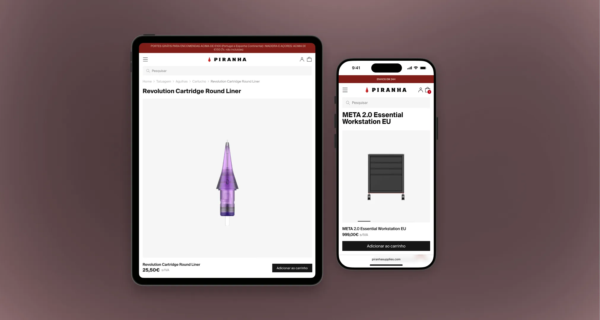
Piranha's catalogue isn't light: it's dense and complex. That's not a problem; it's an opportunity to structure things well. We worked side by side with our integration team to build a structure of metaobjects and metafields able to power different product pages for different products.
A Revolution needle has nothing in common with a Meta power supply, and its page shouldn't be the same either. Each PDP was designed to communicate value clearly and functionally, respecting the brand's visual identity and, above all, the way professionals buy.
Frontend implementation
This is where the store took shape. The frontend was built on the four media queries defined at the start and on a flexible, scalable system of reusable blocks. The data logic, planned from the analysis phase, ensured every component had a purpose: to sell more and better.
Shopify Plus: thinking ahead
Choosing Shopify Plus was a strategic decision. From day one we knew this project had to be ready to scale, and the whole store setup was designed with growth in mind: shopify Markets with shipping rates and payment methods tailored to each market; different themes for different regions; integration with an advanced shipping app for complex scenarios, such as air‑freight restrictions on aerosol products; discount apps for campaigns, promotions and even rappel (volume rebate) discounts, essential to Piranha's wholesale model; vAT exemption for customers in intra‑EU countries.
ERP integration: where the magic happens. The store couldn't be an island. We developed a robust integration between Shopify Plus and Sage X3 that transformed Piranha's logistics operation, cutting operating times by up to 50%. Some of the critical points we solved: synced catalogue attributes; expiry and packaging logic for products, bundles included; translation and market management; instant order integration; orders with instant payment or alternative methods (cash on delivery, bank transfer, Multibanco).
Results
The Piranha project wasn't just another online store. It was an experience built for professionals, backed by a solid technical structure and ready to grow for real.
Supplies went from a static platform to the heart of the brand's online business.
- Reduction in logistics operating times
- Up to 50%
- Reduction in logistics operating times
See more success stories

Darty

- E-commerce engineering
- Design
- UX/UI
High-performance e-commerce focused on automation, scalability and user experience
Tupperware

- Shopify store
- Custom development
- Integrations
Community, tradition and a one-of-a-kind business model

Quebramar

- Migration
- Custom Storefront
- UX/UI
A migration done in detail, for a brand with 54 stores and a loyal community